Lab: Network Analysis
Introduction
Today’s lab is based on Miriam Posner’s assignment on network visualization, with additions from various other humanities and social science network experts, including Martin Grandjean and Clément Levallois.
We’ll use a free application called Gephi, which you can download and install on your laptops. Gephi is a powerful tool for network analysis, but it can be a bit overwhelming at first. It has a lot of tools for statistical analysis of network data, most of which we won’t be exploring in this introductory lab.
Getting Oriented
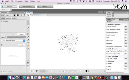
Let’s first get familiar with Gephi looking at one of the sample datasets. Go to Window > Welcome and click on the Les Miserables.gexf file. This is an example of a character co-appearance network, based on Victor Hugo’s Les Misérables. You’ll see an Import Report telling you that this is an undirected graph with 77 nodes and 254 edges. All looks good, so click OK. Click on the Data Laboratory panel in the upper navigation menu and have a look at the data table containing 76 nodes. You’ll see column headers called Id, Label, Interval, and Modularity Class. Someone has already either run a modularity algorithm on this dataset, or they coded the data manually. Modularity is a useful form of “community detection.” More on that here. Communities will have dense connections in between nodes, and sparse connections with nodes in other communities, very much like friend or family groups.
In the upper lefthand corner, next to nodes, you should see a tab called edges. Click on it. This is the edge list, also known as the connections or relationships in between the nodes. Examine the column headers: Source, Target, Type, and so on. You can flip back and forth between your edges and nodes tables to see which character in Les Misérables the id values under Source and Target refer to. We’ll note that this is an undirected network, meaning that the relationships are symmetrical. In other words, Javert talks to Valjean, but it could just as truthfully be said that Valjean talks to Javert.
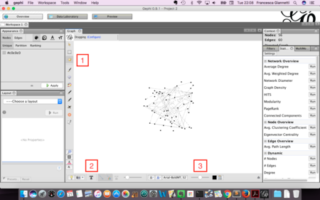
In the upper lefthand side of the navigation menu, click on the Overview panel. Nice, but what on earth are we looking at?? Click on the T (show node labels) on the lower navigation menu to display the node labels. Aha! Next, click on the Preview panel. This is where you would go after you’ve got everything looking just the way you want it in the Overview panel. Click the Refresh button. Your labels will have dropped out, but you can add them again by clicking on Show labels in the menu to your left and clicking on Refresh. You may find that the Proportional size option impairs the readability of the graph. If so, uncheck it, and adjust the font manually to something like 24 pt, and click Refresh once more. Notice that you can export your graph in a variety of formats. Exporting as a PDF leaves the most flexibility for later reuse.
Importing a Dataset
Go to File > Close Project (don’t save). Download the class-nodes.csv and class-edges-undirected.csv files to your desktop. Now we’re going to import our own dataset: go to File > New Project. Navigate over to the Data Laboratory (central panel), and click on Import Spreadsheet. Navigate to where you saved class-nodes.csv and select the file. Be sure you choose Import as: Nodes table from the box that allows you to choose between an edges table and a nodes table. Finally, click Next to move on to the next screen. Import all three columns, e.g. id, label, and category, and click Finish. In the Import report window, set Graph Type to Undirected; make sure to check the box next to Create missing nodes and to select the radio button next to Append to existing workspace, and click OK.
Next, click on Import Spreadsheet once more. This time, select the class-edges-undirected.csv file from where it is stored on your computer. Make sure you choose Import as: Edges table from the box that allows you to choose between an edges table and a nodes table. Click Next. In the following window, make sure that all three columns, e.g. Source, Target, and Type, are selected and click Finish. In the Import report window, be sure that the box next to Create missing nodes is left unchecked and the radio button next to Append to existing workspace is selected. Click OK.
To review, the Data Laboratory is where you can manipulate the data you’ve uploaded. If you click on the Nodes or Edges tab in the upper left corner, you can toggle between the two spreadsheets.
Start Visualizing
OK, we can finally start visualizing. Click on Overview to go to the panel that will show your network graph.
You might be looking at something that looks a bit like a clump of hair somebody left in the shower drain. Huh. Not very exciting just yet, but be patient. Use the scroll wheel to zoom in and out.
- Use the hand icon to move the nodes around.
- Turn labels on by clicking the T.
- Adjust the size of the labels with the scrubber.
What are we looking at? This is a bimodal network graph, meaning it contains two different kinds of things: students and their preferences. Each student is connected to his or her preferences by an edge. It’s still a bit of a mess, though.
Size Nodes
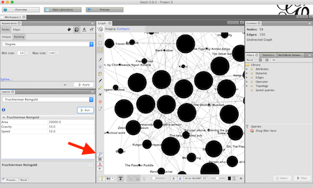
Let’s give nodes a size proportional to their degree (sum of connections). In the Appearance panel at the top left, select “Nodes” and the “Size” icon (looks a bit like a layer cake turned on its side). Under “Nodes”, select the “Ranking” tab. Choose “Degree” in the dropdown attribute menu and enter the minimal and maximal value (try 10-100). Click “Apply.”
Spatialization
Let’s put a little space in between those nodes. In the Layout panel (bottom left), choose the Fruchterman-Reingold algorithm with the following settings:
- Area: 20,000
- Gravity: 10
- Speed: 10
Fruchterman-Reingold is a random layout algorithm that disposes nodes in a gravitational way (attraction-repulsion, like magnets) on the screen. Click on Run, then Stop once the nodes are sufficiently spaced. You may need to click on the Center On Graph button to recenter your graph.
Then, try another layout algorithm: the Force Atlas 2. This one will disperse groups and put space around larger nodes. Be mindful that the parameters you enter can hugely alter the final appearance. I suggest that you check the box next to “prevent overlap” and change “Scaling” to 200. Let the function run until the graph is mostly stabilized.
Style and Centrality
Now let’s add some color so we can distinguish between students and their preferences. Back in the Appearance panel, click on the palette icon (color). Underneath that, you’ll see two tabs: Nodes and Edges. Select Nodes. Within the Nodes tab, you’ll see three additional tabs: Unique, Partition, and Ranking. Be sure that the Partition tab is selected. Then, from the dropdown menu, select category. Click Apply. Now you can distinguish between the students and their preferences! What observations can we make about the class at this point?
Let’s add some more information to our graph by giving the nodes new attributes. Go to the Statistics panel on the righthand side of your Gephi window and click the Run button next to Avg. Path Length. Then close the Graph Distance Report that pops up. This algorithm measures the average graph distance between all pairs of nodes.
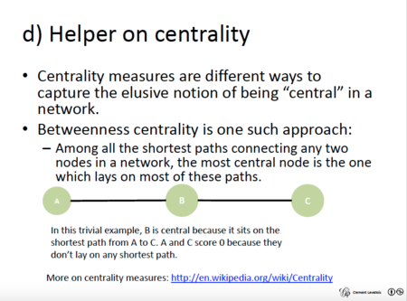
Centrality measures are difficult to grasp at first. Levallois’s slide on the subject might help.
Click on the size (sideways layer cake) icon. Go to the Ranking panel of the Nodes tab. You will notice when you click the dropdown menu that you have some new options for sizing your nodes. This is an undirected graph, meaning that the edges don’t have any directionality.1 Try scaling the nodes by Betweenness Centrality, then Eccentricity. If your labels get a bit snarled, then go to the Layout panel, select the “Label Adjust” algorithm, and click run. Can you understand what each centrality type measures? Is one more meaningful than the other? Why? If you’re curious about the centrality scores assigned either to students or their preferences, you can tab over to the Data Laboratory and click on the measure of centrality to do an ascending or descending sort. Back in the Overview, leave the nodes sized according to the centrality measure of your choice (Degree, Betweenness, Eccentricity).
Modularity
Let’s see if we can identify clusters of students who have things in common. To do this, we’ll calculate modularity. On the Statistics pane (at the right of your screen), click on the Run button that appears next to Modularity. In the next popup window, click OK, then close the Modularity Report when it pops up. Now that we’ve calculated modularity, we can color nodes according to their communities. To do that, go to the palette icon (Color), Nodes tab, and Partition pane. From the dropdown window, select Modularity Class. Finally, click Apply. Now we can see which students’ preferences link them together into communities. Students and/or preferences with closer (or more) ties are shaded in the same color. What, if anything, does this data visualization mean to you?
Projection to One-Mode Graph
Use the MultiMode Networks Projection panel, which should be lurking to the right of the statistics panel. First, go to File > Save and save your network, since this next step will overwrite your data. Click on “load attributes.” You’ll now “project” the preferences onto the students: if two students have an edge linking them with the same preference, the preferences will now have a direct edge between them (and the student names will disappear). Select category as the attribute type, and set the matrix as proposed here:
- preference-person
- person-preference
They must be symmetric with the type of node you want to keep at the beginning and the end (preferences).
The Monopartite Graph of Preferences
Check the “Remove Edges” and “Remove Nodes” buttons, in order to clean the graph of the unselected nodes and edges. And finally click on Run. This produces a preference-preference graph. Be mindful that you just overwrote your original network data. If you need to take a step backwards, close the project without saving it, and reopen your saved project.
With this 1-mode flattening of our class network, notice how we can go to the Appearance pane, select the Edges tab, and underneath it the Ranking tab, and then color our edges by Weight. There are lots of ways to assign weight to an edge, but the simplest expression is the sum of edges. Click on the checkered square to choose a color ramp that will make the stronger edges more visible in your final display.
Next, tab over to the Preview panel. Go to the left sidebar under Edges and click Color > Original. Click Refresh to get your selected color ramp to display. Now you can see more clearly the preferences that you hold in common, as well as those preferences that were outliers.
Also, if you want to remove the black stroke around your nodes (minor visual pet peeve), in the Preview panel, select Nodes > Border Color > parent and then click Refresh.
And with that, you have created a social network graph of our class. Congratulations! Note that you can also do the reverse: project the students onto the preferences. That said, given that you all answered the same number and type of question about your preferences, it seems doubtful that this method would create the most meaningful visualization.
Save and Share
You can save your Gephi graph as a Gephi file, or export it as a .gexf file, so you can open it up again later and edit it. You can take a screenshot from the Overview panel (click on the tiny camera icon on the lower right). You can also click on the Preview pane to see a somewhat nicer presentation of your network diagram, and you can change the look of it on the left-hand side of that pane. (Be sure to click Refresh after each change.) Once you’re happy, click on the SVG/PDF/PNG button to export it as an image file.
-
There’s an argument to be made that our class network should be directed. It may be more correct to say students like films, as opposed to suggesting a symmetrical relationship, as in film -> student is equal to student -> film. We’re treating this as an undirected network however, if only because the Multimode Networks Projection plugin can’t interpret directed networks. ↩