Lab: Networks
Introduction
Today, we will revisit the War Service Bureau and Palladio this time using a different type of visualization: a network graph. In the words of Scott Weingart, a network represents, at the simplest level, “stuff and relationships.”. He further explains:
If you’re studying something with networks, odds are you’re doing so because you think the objects of your study are interdependent rather than independent. Representing information as a network implicitly suggests not only that connections matter, but that they are required to understand whatever’s going on.
My slides, which we’ll go over in class: https://docs.google.com/presentation/d/1hBIrWbpel_uZPrv_FrYZ_h2V2RvWm3r2P8m9zQLN-hY/edit?usp=sharing
Palladio (again)
Lest you thought we were done with Palladio, we’re going to give it another spin, this time using the (network) graph visualization. Palladio doesn’t have everything one could desire in a network analysis application—it is missing layout and analysis algorithms, for example—but one thing it does have going for it is that we don’t have to install anything to use it.1 Huzzah!
Importing data
Let’s have another peek at the War Service Bureau data (see last week’s exercise for a quick reminder of what we did). This version of the correspondence metadata has been created specifically to show senders and recipients, minus their locations, which we don’t need this time around.
Download wsb_edges_names-as-nodes.csv to your computers.
Go to Palladio at http://hdlab.stanford.edu/palladio/, create a new project, and drag and drop the csv into the window where it says “Load .csv or spreadsheet.” Go through the steps outlined here to load the data and verify special characters. We can call this dataset “edgelist,” although it is in fact a combined nodes and edge table. Before visualizing, let’s pause and consider:
- What do the edges represent?
- What do the nodes represent?
- What, if anything, might we learn about the relationships among nodes when we visualize them?
Visualizing data
Click on the “Graph” tab in Palladio. Unlike the map visualization, which gave us a reassuring base map of the world to build on, this time we get a slightly intimidating blank screen. We’ve got to add everything ourselves. Click on settings (the three horizontal bars) in the upper right of your screen.
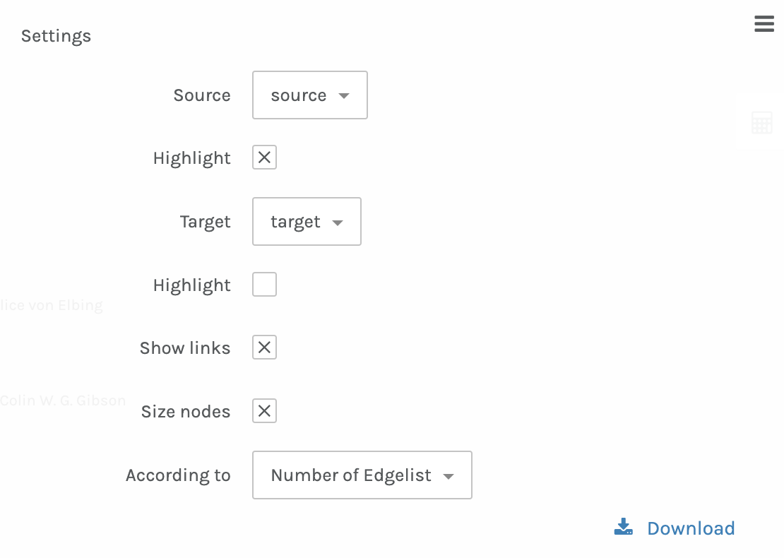
Set “Source” to the source column, “Target” to the target column, and size the nodes based on the number of edges (degree centrality).
Questions
- I realize that we have not read the letters represented by these correspondents and their ties to each other, but even absent those, what can we tell about the correspondence based on what we see in this visualization?
- If we employ the concept of “partial perspective” with our graph visualization, what do we imagine might be absent from our god’s eye view of the War Service Bureau correspondence?
- Any ideas for how we might inject a bit of emotion into this visualization to aid comprehension of the information represented?
Data collection
Let’s take a moment to create a second dataset. Indulge me and respond to this survey: https://forms.gle/M2n97vihr8K8qKaCA. The questions are all multiple choice and it will only take a minute or two. Then I’ll just need a bit to convert the survey data to something we can visualize using Palladio.
Visualizing (again)
Hop on over to the graph tab in Palladio and use the settings to tell the application which are your source and target columns. You might also want to Highlight the source nodes, and size the nodes according to degree centrality (number of edges).
What conclusions can we draw about our tastes as a class?
What can we tell from the way that nodes are clustering towards the center or pulling away towards the outside edges of the visualization?
Do you think you should be BFFs with the people who selected the same things as you? Why or why not?
Can you draw any parallels to your knowledge and experience of online social networks?
-
I also considered Network Navigator for this exercise, but the simplicity of reusing the same application as last week won out. ↩